Zine
May 5, 2009
reading 12
April 21, 2009
Ede, Lisa and Andrea Lunsford. “Intertexts” / “The Concept of Authorship”
1. What are benefits that we may receive from collaborative working environment? Do you believe that working in this condition would take one’s individuality away?
2.The theatre, of course, is the most collaborative of all the arts. Though Shakespeare was an adaptor rather than a collaborator in almost all of his work (pg.9)
The writers state that Shakespeare is an adaptor, not a collaborator…
If we adapt another’s idea to come up with something new is tht collaboration or an adaption? We work individually, but if another’s work/idea was involved in the process of developing our initial idea, isn’t that a collaboration? or is that still an adaptation?
reading 11
April 14, 2009
Bolter, Jay David and Richard Grusin. “Networks of Remediation”
1. Throughout the reading, it seems as if the writers separate the idea of “medium” and “device” by categorizing the applications based on these two terms. How are they different?
2. “The remediation of material practice is inseparable from the remediation of social arrangements” Can you think of any interface that portrays how space functions as communication in a social context?
3. How does media generalize gender perspectives? How does remediation revolve around gender?
I’m really confused about this part… is the article simply saying that what we understand from remediation may be difference because of gendered perspectives?
Poster Project
April 13, 2009
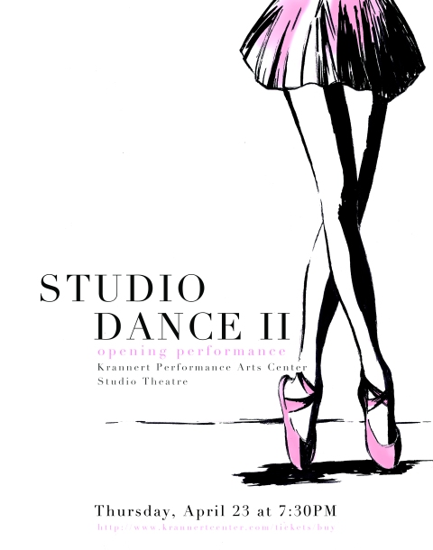
dance performance
reading 9
March 31, 2009
GRID thinking with type
1. How did Jan Tschichold’s theory of “the new typography” affect modern designers? How did he use grid systems to illustrate new meaning of typography?
2. How are grid systems used in web differ from grid construction for print media? Do you think grids are more useful in web?
3. How are grid constructions related to the actual content? for example, designers can express with text to illustrate meaning of the content,but can grids express the content as well? or are they suppose to just organize the content? (refer to pg 138-golden section)
‘zine – logo design
March 31, 2009

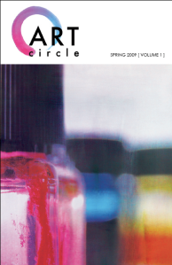
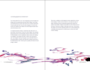
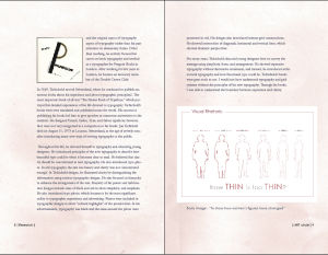
'zine - art circle
attributes
1.eternal
2.tranquility
3.passion
4.humanistic
Jan Tschichold
March 31, 2009
Well-known as an eminent activist of Modernist design, Jan Tschichold served as a typographer, a calligrapher, an author, and as a teacher throughout his life. Tschihold was born on April 2, 1902 in Leipzig, Germany. Although he was the most influential typographer of the 20th century, his focus at first was concentrated on becoming a fine arts painter or a drawing teacher. However, his father’s profession in script writing generated his interest in typography, and he developed his interest at the age of sixteen by studying various books based on calligraphers such as Edward Johnston and Rudulf Von Larich. From the books he studied, he developed curiosity in old typefaces and started to create calligraphy writings. His goal for the future was now concentrated on becoming a typeface designer. To expand his knowledge on type design, he studied at the Academy for Graphic Arts in Leipzig in 1919 to 1921.
At the academy, Tschichold learned engraving, woodcutting, and book binding by Professor Hermann Delitch. However, Tschichold already knew everything that was being taught; therefore, during his third year at the academy, he was asked by the academic director, Walter Tiemann, to teach script writing to an evening class. During this time Tschichold was also designing for Leipzig trade fair advertisements. Besides his works as a designer, teacher, and as an assistant to Delitch, he developed his knowledge in typography by studying other designers’ incorrect treatment of design. Tschichold believed that designers really did not know how to apply typography to book designs. He continued to study others’ works while working at the Fisher and Wittig, a major book printer in Leipzig, in 1923. Through his studies, he was engaged to the Bauhaus style that he saw at the exhibition in Weimer. He was attracted to the simple look of the fundamental approach to the Bauhaus design. He considered this to be the new movement of typography, and concentrated mostly on the arrangement and the layout of his design, influenced by the Russian artists. Moreover, he also applied modern painters’ styles of artists like Laszio Moholy-Nagy and El Lissitzky to his typographic arrangement. From studying the methods of arranging, he defined a “cure for typography to be the typography placement” upon strict rules, adopting symmetrical setting, and using sans-serif typefaces.
Based on his studies, he publicly announced his views on “Elementary Typography” in 1925, which became an intense focus among the designers. Four main concepts were focused on his manifest. He believed in typographic emphasis as function, communication in typography, the elementary means of using basics like sans serif typeface, and use of external organization. Tschichold’s focus on elementary design dramatically changed the public’s view for typography. In 1928, he surprised the designers again by publishing a book called “The New Typography,” which was the most essential book for beginning typographers.
However, during this time, the Nazi government rejected the use of new typography. He survived rejection by starting a new beginning by working at the Basel School of Applied Arts and at the Benno Schwabe, publishing house in Basel as a foreigner. He continued to publish more books. He introduced “Typographic Design” in 1935 and then “Typeface Theory, Practices and Sketches” in 1942, focusing on the classic and the original aspect of typography rather than his past attention on elementary forms. Other than teaching, he entirely focused his career on book typography and worked as a typographer for Penguin Books in London. After working for few years in London, he became an honorary member of the Double Crown Club.
In 1949, Tschichold moved Switzerland, where he continued to publish numerous books about his experience and about typographic principles2. The most important book of all was “The Master Book of Typefaces,” which portrayed his detailed experiences of his life devoted to typography. Tschichold’s books were even translated and published across the world. His success in publishing his books led him to give speeches at numerous universities to the students. He designed Transit, Saskia, Zeus, and Sabon typefaces; however, they were not very recognized in a comparison to his books. Jan Tschihold died on August 11, 1973 in Locarno, Switzerland, at the age of seventy-one, after introducing many new ways of viewing typography to the public.
Throughout his life, he devoted himself to typography and educating young designers. He introduced principles of the new typography to describe how beautiful type could be when it becomes clear to read. He believed that clarity should be concentrated in new typography. He also introduced typo-photo. In old typography, the aim was beauty and clarity was not concentrated enough. In Tschichold designs, he illustrated clarity by distinguishing the information using various typographic designs. He also focused on hierarchy to enhance the arrangement of the text. Majority of his poster and information designs include areas of black and red to show simplicity and emphasis. He also introduced typo-photo, which became to be the most significant utility in typographic expressions and advertising. Photos were included in typographic designs to show “cultural highlights” of the present time. In his advertisements, typography was black and the areas around the photo were presented in red. His designs also introduced intense grid constructions. He showed intersection of diagonals, horizontal and vertical lines, which showed dramatic perspectives.
For many years, Tschichold educated young designers how to convey the message using simplicity, form, and arrangement. He showed expressive typography without decorative ornaments, and instead, he introduced architectural typography and how functional type could be. Tschichold’s books were great tools to use. I would not have understood typography and grid systems without the principles of his new typography. Through his books, I was able to understand the boundary between expression and clarity.


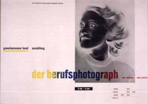
reading 8
March 17, 2009
TEXT thinking with type
1. Tracking adjusts “overall” space while kerning unifies the letters by adjusting individual spaces (between two characters) between the letter forms. Yes, we can recognize the difference by knowing the definition, but how can we visually distinguish the two? Lupton states that in kerning, “if letters in a typeface are spaced too uniformly, they make a pattern that doesn’t look uniform enough” Does that mean that kerned letters seem more unified than letters that are tracked?
2. referring to pg. 94} how do hierarchies help organize information? In what ways could you create hierarchy?
3. Do same rules apply on web and print media? How do web text(hypertext) differ from print text? Do you believe that hypertext is more accessible and can be more expressive than print text?
comments/thoughts…
pg. 94 } Lupton states that italic is the standard form of emphasis, but as other alternatives, bold, small caps, different font, or change in color can also create emphasis. I just want to add that “space” and text size also create emphasis. I believe that specific contents can also be stressed by increasing or decreasing the space between the letter forms.
this quote really stood out to me… pg.67} “writing moves words from the sound world to the world of visual space, but print locks words into position in this space.”
reading 7
March 12, 2009
LETTERS thinking with type
1. Various typefaces are introduced in the book. Were you able to recognize the differences? could you find a specific type that was more readable? and if so, how and what make them more readable in contrast to other typefaces?
2. new forms of letters were created in the nineteenth century for advertising purposes. (Big and bold faces were introduced typographic tradition slowly disappeared) Do you think this was effective? What are the main roles of the letters? are they suppose to communicate and call for an attention? or is being readable enough?
3. How would you be able to define if you’d want to italicize, add quotation marks, make the letters bold, or add no? or should we focus more on the concept? ( like.. how much the letters present or speak about the brand)
Typography Analysis
March 9, 2009

Joost Schmidt
Bauhaus, located in Germany, is an institution that focuses on fine and applied arts/crafts. Over the years, Bauhaus changed the new “outlook” of art and design. Bauhaus was well known for introducing modernist architecture and design and how it applies to various art form. It had a great impact on developments in art and design.
The poster above was a poster designed for the Bauhaus exhibition held in Weimar. It was designed in 1923, which was the year when “new typography” was introduced to the Bauhaus. At first, the founders of the Bauhaus did not see typography as the central role in design. However, after the “new typography” was introduced as the most important communications medium, the instructors at Bauhaus began to design unique layouts for typographic designs. They were concerned with the “clarity of the message in its most emphatic form.”
Since the introduction of new typography, instructors strived to develop new ways to convey messages. Instructors like Maholy-Nagy and Joost Schmidt developed “avant-garde” typesetting to create a new vision. In various experiments, they saw types forming unique shapes and its arrangements were based on contemporary themes.
Joost Schmidt designed posters for Bahuaus exhibitions based on his experiments with avant-garde typesetting. The poster above was one of his designs for Bauhaus exhibition in Weimar in 1923. To reflect the Bauhaus’ characteristics, he tried to incorporate all forms of art practiced at the Bauhaus – architecture, typography, photography, sculpture, and painting. The poster was printed using color lithography, which is a method in which a stone or a metal plate is carved or etched. This was the very first Bauhaus poster and demonstrates characteristics of the New Typography. The essence of the New Typography was clarity, and hierarchy was the key solution to achieve clarity.
This poster is very simple, yet the sharp angles and various geometric forms are very striking. Different components on the poster almost seem like puzzle pieces forced to form unity . An abstract composition of rectangular segments, diagonal bars, and circular forms are dynamic. The diagonal tilt helps the viewers to follow the rectangular segments to see the Bauhaus logo located inside the circular segment. Then the viewers are immediately able to read the word, Bauhaus. The poster includes great sense of Hierarchy. Informations regarding the exhibition are divided clearly, and follows the order of importance. The information is separated into three different parts. First, we read what the poster is about (exhibition). The word Ausstellung, meaning exhibition, catches the eye because it’s the only word that floats in the white space and separates itself from the diagonal bars. While other words follow its nearest forms, “ausstellung” is not placed next to or against any forms. Then we read who the poster is about, Bauhaus. Lastly, place and dates are read. The poster emphasizes contrasts but at the same time, these contrasts create a new unity. Forms are made by joining the opposites together and these forms create a rhythmic expression. The overall design is function and modern.

exhibition poster
I rotated the canvas through photoshop to see if it’d make any difference. Visually, the diagonal tilt brings so much emphasis compared to the centered version above, and introduces us to a new grid system that was not available during that time. I think Joost Schmidt had a great impact on how the posters are designed today.He developed a new system, and a new way to communicate using typography in forms. Placing type in certain forms create more emphasis and strengthens the message.
